Table of Contents
ToggleColor is one of the most powerful, and underrated, tools in a small bathroom. While many homeowners default to white or beige, the right palette can actually make a cramped space feel larger, brighter, and more intentional. Small bathroom color schemes aren’t just about what looks pretty: they’re about optical illusions that trick the eye into perceiving more room, better lighting, and a sense of calm. Whether you’re working with a half bath, a tiny ensuite, or a classic powder room, understanding how colors interact with light and reflection transforms the entire experience. This guide walks through color strategies that work, from soft, expansive neutrals to strategic bold accents that add personality without shrinking the space.
Key Takeaways
- Light and cool-toned colors in bathroom color schemes for small bathrooms create optical illusions of depth and airiness by reflecting light and making walls feel farther away.
- Strategic bold accents—such as a single navy accent wall, dark vanity cabinet, or patterned floor tile—add personality to small bathrooms without overwhelming the space when paired with light walls.
- Monochromatic and neutral palettes with subtle undertones (soft grays, warm creams, pale taupe) provide visual interest while maintaining the cohesive, calming foundation that small spaces require.
- Always test paint colors with large sample swatches in your actual bathroom under real lighting conditions for 3–5 days before committing, as undertone shifts dramatically affect how colors interact with fixtures and natural light.
- Feature finishes like bathroom-grade wallpaper, shiplap, and accent tile offer texture and personality that flat paint alone cannot achieve, while maintaining humidity resistance and visual spaciousness.
- Metal fixture finishes (brass, chrome) directly influence which color undertones work best; matching warm or cool undertones to existing fixtures prevents the small space from feeling chaotic and disjointed.
Why Color Matters in Tiny Bathrooms
Small bathrooms live and die by contrast and light reflection. Color isn’t decoration here, it’s architecture. Dark colors absorb light and visually compress walls inward. Light colors reflect light around the room, creating the illusion of depth and airiness. Bathrooms are also uniquely challenging spaces: they’re often windowless or have minimal natural light, humidity affects how paint appears over time, and the confined walls mean color decisions feel more dramatic than they would in a living room.
The 2026 trend in small bathroom design moves away from the sterile, featureless white box that dominated the 2010s. Homeowners now understand that small doesn’t mean bland. Instead, successful small bathroom color schemes balance visual expansion with personality. This means choosing a dominant light or neutral base, adding depth through undertones and finish variations, and using bold color as a controlled accent, not as the foundation. When done right, a thoughtfully colored small bathroom feels more intentional, grounded, and eventually more spacious than a generic all-white one.
Light and Airy Palettes for Expanding Visual Space
Neutral and Monochromatic Approaches
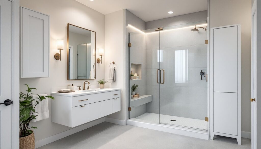
Neutrals are the foundation of small bathroom color schemes for a reason: they work. But “neutral” doesn’t mean boring beige anymore. Think soft grays, warm creams, pale taupe, and off-whites with subtle undertones. The key is choosing a neutral with depth, one that shifts slightly depending on lighting conditions rather than sitting flat and cold.
Monochromatic schemes take this further by using one color in multiple values (light, medium, and dark) to create visual interest without clashing. For instance, a bathroom might feature pale gray walls, medium gray tile, and charcoal grout. This approach feels cohesive and calming while avoiding the one-note flatness of true white-on-white. Layering different textures within the same color family, matte walls, glossy subway tile, textured towels, adds dimension that reflects light in varied ways, making the space feel larger.
When selecting a neutral base, consider the undertones. Warm neutrals (creams, greiges with golden undertones) pair well with brass fixtures and warm lighting. Cool neutrals (soft grays, pale greens) suit chrome and cool-white LED lighting. Mismatched undertones make a small room feel discordant and cramped.
Cool Tones That Recede and Open Up
Cool colors, pale blues, soft sage greens, cool grays, and lavender-tinged whites, are optical winners in tiny spaces because they recede visually. This means walls feel farther away than they actually are. A bathroom painted in pale blue or soft aqua naturally feels more expansive, especially when paired with white or cream trim and light fixtures.
Soft sage green has become increasingly popular in small bathrooms because it bridges the gap between calming and alive. Unlike pure gray, which can feel sterile, sage has warmth and connection to nature. It pairs beautifully with bathrooms with beadboard finishes and natural wood accents for a cottage-inspired aesthetic. Pale, muted blues work especially well in bathrooms without windows, as they create the psychological impression of water and sky, bringing the outdoors in.
The trick with cool tones is keeping them light. Pale is key. Medium or dark cool colors in a small space feel oppressive rather than expansive.
Bold Color Strategies for Small Bathrooms
Bold color doesn’t mean painting all four walls deep teal. It means strategic, intentional application that adds personality without suffocating the space. Small bathrooms are ideal for bold color when it’s confined to a single accent wall, floor tile, or vanity cabinet.
Consider a deep forest green or navy on a single wall opposite the entry, this creates a focal point that draws the eye and defines the space without overwhelming it. The viewer’s brain registers the bold color as intentional design rather than claustrophobic enclosure. Pair it with light walls on the other three sides and glossy tile to bounce light across the bold accent.
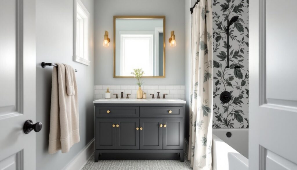
Another approach: keep walls light but go bold on the vanity cabinet. Bathrooms with black vanities exemplify this perfectly. A sleek black or deep charcoal vanity against pale walls creates dramatic contrast and anchors the space visually. The vanity becomes functional art rather than background furniture, and the surrounding lightness prevents the bold color from feeling heavy. Design inspiration from platforms like House Beautiful shows this strategy working across styles, from modern minimalist to transitional.
Floor tile is another vehicle for bold color in small bathrooms. Patterned encaustic tile, terrazzo, or even a single bold color under underfoot brings energy without raising the ceiling-to-floor height of the walls. The eye naturally looks down briefly and back up to the lighter upper half of the room, maintaining the sense of openness.
Accent Walls and Feature Finishes
An accent wall behind the vanity or opposite the entrance works particularly well in small bathrooms because it’s limited in scope yet visually impactful. The wall is seen from a single vantage point (the toilet or tub), making bold color feel intentional rather than overwhelming.
Feature finishes go beyond paint. Wallpaper (specifically bathroom-grade vinyl wallpaper rated for moisture) adds texture and personality in a way flat paint cannot. Small-scale geometric prints, subtle botanical patterns, or textured finishes can enliven a 3-by-5-foot wall without dominating the room. Moody bathrooms creating a serene space often rely on rich wallpaper or paint finishes paired with reflective surfaces (mirrors, polished tile) to maintain visual openness even though the darker tones.
Shiplap or bathrooms with beadboard are physical accent textures that also shift color perception. White shiplap in a small bathroom reads as cottage-style calm, while dark-painted shiplap adds architectural interest and drama. The vertical lines of shiplap also create the illusion of height, a crucial trick in basement bathrooms or spaces with low ceilings.
Tile is another accent medium. A single feature wall of patterned tile, marble, or mosaic behind the vanity adds luxury and visual anchoring without requiring paint color decisions across the entire room. This approach is particularly effective in IKEA bathrooms where budget constraints might limit options: a small accent tile installation makes a bigger impact than painting.
When choosing finishes, remember humidity. High-gloss paints and properly installed bathroom wallpaper resist moisture better than matte paints. Ensure adequate ventilation regardless of color choice.
Practical Tips for Testing and Implementing Your Scheme
Before committing to a color, test it in your actual bathroom under the specific lighting conditions you have. Paint cards are useless: they’re too small and never show undertone shifts in real light. Purchase sample quarts of your top three color choices and paint large test swatches (at least 2 feet by 3 feet) on different walls. Live with them for 3–5 days, observing how they look in morning light, evening light, and with artificial lighting on.
Pay attention to how your bathroom’s existing fixtures affect color. A brass vanity pulls warm undertones forward: chrome emphasizes cool ones. If replacing fixtures isn’t in the budget, choose colors that complement what’s already there. Mismatched metal finishes in a small space feel chaotic.
Consider the psychological impact of your choice. Bathrooms are personal spaces where people shower, prepare for the day, and sometimes decompress. A small bathroom should feel calm and inviting, not like a fashion statement. Soft, muted tones reduce decision fatigue. If you love jewel tones, use them sparingly via towels, a single accent wall, or art rather than across all surfaces.
Implementation order matters. Paint walls first, then add tile, fixtures, and finishes. This prevents color mismatches and allows you to adjust if early choices don’t work with subsequent selections. Primer is non-negotiable in bathrooms: bathroom-specific primers resist moisture and ensure topcoat adhesion better than generic primers.
For renters or those hesitant about permanent changes, removable wallpaper, paint in less visible areas (inside cabinet interiors, under sinks), and textile color (towels, a shower curtain in bold print) offer color exploration without commitment. Resources like Apartment Therapy showcase budget-friendly, temporary color strategies for small bathrooms. Many affordable design updates, towel racks, mirrors, lighting, shift the perceived color palette without touching walls.
Making Your Small Bathroom Feel Larger Through Color
Your small bathroom’s color scheme is the quickest, most impactful investment you can make. Whether you choose light, airy neutrals, cool tones that recede, or strategic bold accents, the goal remains the same: making the space feel intentional, spacious, and yours. Start with paint samples, respect the interplay between color and light, and remember that small doesn’t mean you have to sacrifice personality. The right palette transforms a utilitarian closet into a room you genuinely enjoy entering.